
Lewis Warren
How to optimize images for WordPress and boost your site performance
If your site performance is poor, there's a good chance that your images are a large part to blame. Images contribute to the overall page size, increasing the load time experienced by the user. Each image also requires a separate HTTP request, meaning that using many on a single page can slow things down.
A slow site may seem like an inconvenience, but there's a very good chance it's also causing your users to bounce and ultimately harming your conversion rate. Worst of all, a poorly-optimized site may be penalized by search engines, negatively affecting your search ranking.
Bloated images also hurt accessibility. They dramatically increase load times, making pages harder to download for users with slow internet connections. Browsing your site becomes more expensive for mobile users on a data allowance too.
This post walks you through how to optimize images for WordPress using a practical six-point checklist. We'll also show you how DebugHawk can help identify images that need attention.
Improving WordPress performance often requires trial and error, but fixing how you serve images is one of the easier wins that yields big improvements.
Image optimization checklist
- Serving compressed images
- Serving images in modern file formats
- Defer loading of off-screen images
- Serving images at the right resolution and dimensions
- Serving responsive images
- Using a CDN to serve images
Serving compressed images
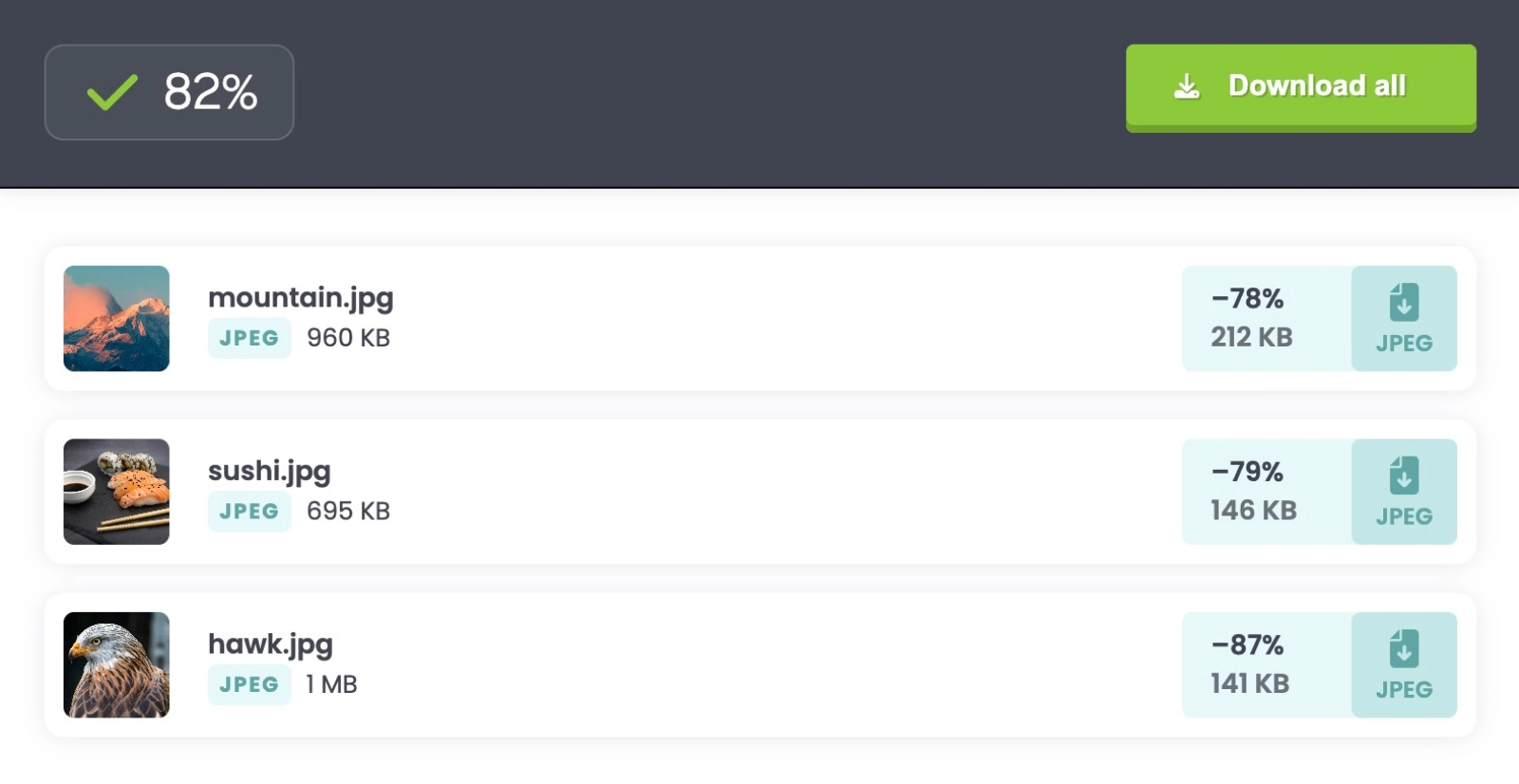
If you're not serving compressed images, start here. This will get you the most performance gains right off the bat. Compression doesn't necessarily mean a reduction in image quality. There are many tools capable of applying heavy compression to images without any discernible reduction in quality, not to the human eye anyway. You can expect anywhere between a 10-80% reduction in file size depending on the image, and even more in some cases.
If you build your assets via the command-line, we recommend adding a compression layer using packages such as Imagemin, ImageOptim or Mozjpeg, so that this is taken care of automatically.
Alternatively, if your site is powered by WordPress there are many plugins such as EWWW Image Optimizer, Smush or Imagify that will automatically compress your images upon upload.
While this could be a whole article in itself, we recommend being mindful about using too many plugins to achieve tasks like this. Ironically, poorly-optimized WordPress plugins may harm your site performance in various ways. You can test the impact a plugin is having on your WordPress site by monitoring your performance metrics before and after enabling a plugin.
There are also sites such as TinyPNG that will allow you to bulk compress images manually via their site.
Serving images in modern file formats
Serving your images using modern file formats can help you reduce your page load time even further.
AVIF and WebP are the two most popular of these formats and are widely supported on all major browsers. If for some reason you need to support Internet Explorer, you will have to provide a fallback.
The AVIF format offers very efficient lossy and lossless compression and is often reserved for photographic images that require high-fidelity and color accuracy. AVIF files can also handle animations too.
The WebP format is more versatile and can be used for a wide range of images. Its versatility makes it a more popular image format and if you're unsure over which file type to use, opt for WebP.
Similarly to step one in this checklist, if you build your assets via the command-line, we recommend converting your images to modern formats before applying compression.
WordPress plugins such as EWWW Image Optimizer can also convert your images to WebP automatically on upload.
There are also many sites that will manually convert your images to modern formats, such as Squoosh.
These first two steps of the checklist will likely give you the biggest performance gains. So even if you only complete these two for now, your site will be in better shape than before.
Here's an example of how you can use modern image formats to take advantage of performance gains today, while including a fallback image for older browsers.
<!-- Using the WebP image format with a JPEG fallback -->
<picture>
    <source srcset="hero.webp" type="image/webp" />
    <img src="hero.jpg" alt="Hero Image" width="800" height="600" />
</picture>
Defer loading of off-screen images
When a user visits a page on your site, it will attempt to load all of your images and assets at once as different HTTP requests. This can take quite a while to complete if you are serving a lot of images, decreasing the user-experience. Luckily, there's an easy fix to this problem.
You can defer images so that they load only when they are needed. If you've heard the term lazy-loading before, this is essentially the same thing. Rather than load all images at once, we load them as they are about to enter the viewport. This can have a dramatic effect on your page performance and it means that when the user loads a page on your site, only the images that they will immediately see above the fold will download as a HTTP request.
Deferring is a recommended practice to all your assets including files such as videos and JavaScript. For the purpose of this article, we'll stick to discussing images, but it's definitely something worthwhile to consider.
You can use the loading attribute on your images to defer them:
<img src="/assets/images/test-image.webp" loading="lazy" alt="a test image" />
If you're a WordPress user, your images will be lazy-loaded by default if you're using version 5.4 or higher. If you're using an older version of WordPress, there are many performance based plugins that will allow you to do this by turning on a setting. Perfmatters is one popular option.
Serving images at the right resolution and dimensions
It's important to make sure that the images you are serving are practical in terms of their resolution and dimensions. If your blog container has a width of 800 pixels, and you insert an image that's 2500 pixels wide, then that's a real waste of file size and will add excessive fat to your overall page load.
The image will be forced to shrink down to 800 pixels width so that it renders at the correct size anyway, but behind the scenes the image will still be 2500 pixels wide and bloated for this particular use-case.
As a result, it's important to consider the resolution and dimensions of every image based on the context of where it is used.
We also recommend specifying the dimensions (width and height) of your images in HTML to allow browsers to allocate space for them during page layout, preventing layout shifts and optimizing rendering performance. For example:
<img src="/assets/images/test-image.webp" loading="lazy" alt="a test image" width="800" height="600" />
Serving responsive images
You can leverage the srcset HTML attribute to serve responsive images that adapt to different screen sizes and resolutions. If you have a 1600 pixel wide photo on your homepage, there's no reason for a mobile user to download that same image when their screen is far smaller.
It's also important to remember that desktop users are likely to be using a more reliable internet connection at home or in the office, whereas mobile users will experience more variability when it comes to connection speed.
As a result, it's a good rule of thumb to ensure that your site is optimized as much as possible on mobile devices, and serving responsive images will ensure the browser fetches the most suitable version based on the user's device. It can be a primary factor in having a healthy conversion rate.
Here's the srcset attribute in action:
<picture>
    <source srcset="/assets/images/test-image-small.webp" type="image/webp" media="(max-width: 400px)" />
    <img src="/assets/images/test-image.webp" loading="lazy" alt="a test image" width="400" height="300" />
</picture>
In the above example, the smaller more-optimized version of the image will be served until the viewport is at least 400px in width.
As with most of the other points in this checklist, there are various packages that can be used to generate responsive versions of your images automatically. If you're a WordPress user, responsive images will be generated automatically if you're using version 4.4 or higher. If for some reason you're using an older version of WordPress than this, there are plugins that can generate them for you.
Using a CDN to serve images
A CDN (Content Delivery Network) caches copies of your images on servers around the world, so visitors download them from whichever server is closest. Without one, every image request goes back to your origin server, regardless of where the visitor is. That adds latency, and it puts unnecessary load on your hosting.
Most CDNs require minimal setup. Cloudflare offers a free tier that covers image caching out of the box. If you're looking for something more image-specific, services like Imgix and Bunny Optimizer can also handle format conversion and resizing at the edge, combining several steps from this checklist into a single service.
For WordPress, a CDN plugin like WP Offload Media can rewrite your image URLs automatically. Or if you're already using a full-page caching plugin, check whether it includes CDN support before adding another plugin to the mix.
Measure the impact
After working through this checklist, you'll want to verify that the changes actually made a difference. The easiest way to do that is to look at how your images affect your overall page weight.
DebugHawk's Network Requests view breaks down every request by type, so you can see exactly how much of your page is made up of images compared to everything else.
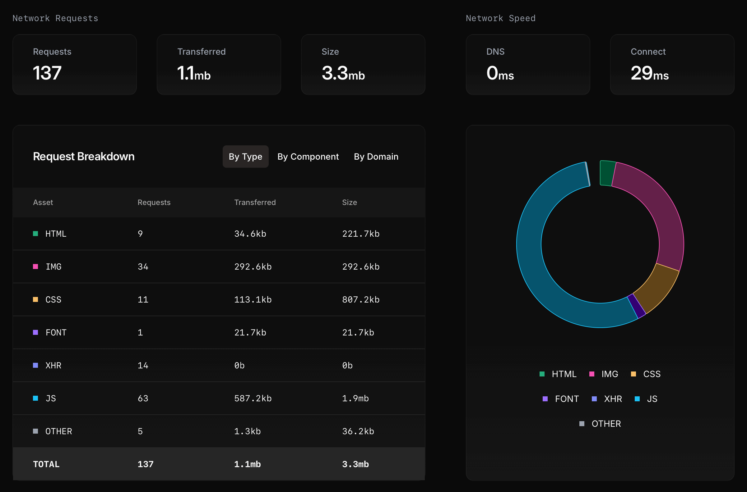
In the example above, images account for 34 requests and 292.6kb transferred. That's modest compared to the 63 JavaScript requests totaling 587.2kb. If your own breakdown shows images dominating the transferred column, that's a sign there's more optimization to do.
This is where real user monitoring has an advantage over synthetic testing. A tool like Lighthouse runs a single test from one device. But your visitors are loading different image sizes depending on their screen, connection, and browser. WordPress serves different variants via srcset, so the same page can transfer very different image payloads depending on who's viewing it.
DebugHawk captures this data from every visitor, so you can see how your images perform across the full range of devices and connections hitting your site. If your images contribute to a slow Largest Contentful Paint (LCP) score, you'll see that too, since the largest visible element on a page is often an image.
Conclusion
Learning how to optimize images for WordPress is one of the highest-impact changes you can make to improve site performance. It can be the difference between a page that loads slow and one that loads fast.
By following this six-point checklist, you'll ensure your images are compressed, served in modern formats, lazy loaded, properly sized, responsive, and delivered via CDN. Many WordPress sites skip image optimization entirely, resulting in pages that are megabytes heavier than necessary.
The plugins mentioned throughout this guide make the process easier, but remember to monitor your performance metrics to verify the improvements are working as expected.
